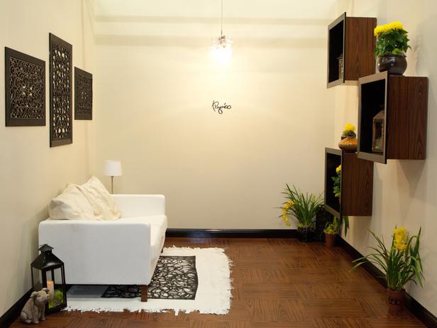
Tuesday's episode was the dreaded "white box challenge," where each designer gets a white room with a few pieces of white furniture that they have to transform.
It looks like my favorite designers on the show have been reading some of my favorite blogs. The things popular in the blogosphere were also popular with these designers: bold, graphic designs (including chevron and a Moroccan trellis pattern), gold or brass accents, nailhead trim, silhouettes, and starbursts.
I'll start off by showing you a few of my favorites.
I thought Rachel did an amazing job on this room. The colors and mix of patterns are unexpected, but work together well. I love that she super-sized the trellis pattern in the background. The fashion art on the right wall is pretty amazing as well.
Britney's gold chain chandelier is so creative, and of course, you know I love navy, white and gold together. It's hard to see here,but she also added gold tacks as nailhead trim on the couch.
Danielle's room is FANCY with all of its sparkly gold accents. The couch, off-center graphic and the gold circles are all favorites. I think I had that lamp in my first college dorm room...I might have ditched that element.
Now on to some of my least favorites.
The judges were in love with this room designed by Stanley, but seriously who lives here???? I get it that it's creative, but who wants a sideways couch on stilts in their living room. This looks like a gallery installation versus a place where people could actually live and be comfortable. I think there has to be some element of functionality to a room, not just crazy ideas.
What the what??? This room was a little too "high concept" for me...something about forest fires. Kris annoys me...I don't think I would ever be able to sit through his show.
I hated almost everything about this room. Luca's idea of using contact paper to make a faux parquet floor is pretty cool as is his light bulb chandelier. Someone who signs their name to their room is a bit too cocky for my liking.
Here are a couple rooms that had elements I liked.
I like the coffee table with the black stripes and brass washers. I didn't love the chain trim along the bottom of the couch, but I like it on the cushions.
The silhouette/starburst is my favorite element in Bex's room. But, I also like how she used the pieces of cut PVC pipe to make "columns." The buffet with the towel holder pulls works well too. Bex's personality might be a little too quirky (or trying too hard to be quirky) for me to want to watch her show.
Mikel's room didn't blow me away, but I thought it was clever to use a door mat as a stamp for his rug.
At this point my favorites are Rachel and Danielle.
What did you think??? Discuss....


.png)


.PNG)


10 comments:
your favorites are mine, too! and i still do not get that room they loved. at all. lame.
I loved your top three as well. Not only do I not get Stanley's room. I dont get Stanley. Are you a designer, an artist, a punk? I'm not sure. I don't even think he knows.
I was impressed the Bex pulled something out after basically giving up halfway through. If Hilari would have stopped complaining for 2 seconds about how she doesn't do this stuff, then she might have had time to make that couch look better.
That's my two cents. :-)
I swear I could have written this post, except I really like Brittany too! She just makes me laugh, I think she and I could be buddies (so far, she could be a total B by episode 6...)!
Oooh good, Design Star gossip!! Just finished watching this week's episode over lunch...I DVR them and watch while Maura is napping:) I definitely liked Rachel's room the best...both her and Danielle were at the top this week and last week, so I feel like they are the one's to beat at this point. I didn't really like Stanley's room either, but I think this challenge is all about trying to be crazy, and the judges just liked that he did something weird. I totally would suck on this show - you are right, Suzy, how do you they come up with something so quickly? I'm too mainstream for this, and I don't know enough how to use power tools:)
Didn't see the show, but the first room you showed is by far my fav. I don't even understand the room with the couch sitting on end. How does that make someone a designer??
I am so glad you are joining us for the Olympics!! Can't wait to see what's in store!
I haven't watched any from this season yet. I love some of the great ideas people come up with though (like the contact paper floor and doormat stamp). So glad you'll be participating in the Bloggy Olympics. I'm sure you'll come up with something cool.
The top 2 are my favorites too - they are confident and know their own style. It is all very subjective, isn't it? I was not a fan of the industrial design but the judges liked it because it was different and thinking outside-of-the-box.
Rachel's room with that bold graphic on the wall ... and the way she just "whipped out" that fashion painting. She is my favorite this week. I agree about the sideways sofa ... creative, yes. I guess I don't understand the rules!!
just caught up w/ a design star double feature last night w/ the whole family....and i'm with you on this post. yuck to the sideways couch, eek to the ego behind the signature on the wall and ugh to the whiner.
can't wait til the next episode!
Post a Comment