WARNING: there are a ton of pics and I didn't try to do anything to make my house look extra-pretty or styled. This is how it generally looks.
Here is what you see as you walk in my front door. We are standing in the entryway and the living room is straight ahead.
The piano is on your right as you are walking into the living room. I have thought about painting the piano, but haven't attempted it yet. I don't know what color to paint it. It also seems like a BIG job.
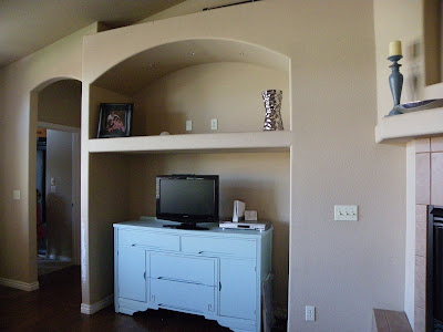
Here's an old buffet that I refinished that we use for our TV. I have no idea what to do with the opening above the TV. I used to have a long, narrow painting up there, but I took it down because I don't like it anymore.
This is the main seating area, an ugly old microfiber green couch. I also have rug here that is way too small. I never realized how off-center the table and rug are before looking at this picture! I'm thinking I want to get a natural fiber rug, maybe jute. In the background you can see my little dining area on the right and the kitchen is on the left.
Here are a few views into the living room from the kitchen.
Here are a couple of shots looking back towards the front door.
ACK!!! I can't believe I'm actually showing you my ugly, used-to-be white, recliner!
I have no idea what to do with these little niches/plant shelves. I used to have some fake plants up there (ugh!) and some knicknacks, but I didn't like them and things get so dusty up there. I want a clean, crisp look.
More plant shelves, and the mantle could definitely use some help!
That should give you a pretty good idea of where I live. Kind of beige and boring and ready for change! I can't wait to see what the designers, both named Lindsay, at Sadie+Stella have in store!


.png)


.PNG)


3 comments:
I have a very similiar floor plan and at first thats how I wanted it and now it's really bothering me!! But mine's even worse because when you walk in the front door its also open to two front rooms (supposed to be a dining room and well I don't really know - maybe an office. Anyway, I love all the arches in your house! I'm thinking of added some in mine. Well very long comment, but I'd love to see what you do here.
The room has so much potential - it is exciting to be able to redecorate it - and is sure to look fabulous!
This is a really great space and some really cool architectural features too. I love that it's one big great room. So excited to see the plan. I love that you can see it from the entryway too - I see some bold window treatments in your future. FUN!!
Post a Comment